This document outlines three design directions for evolving the look-and-feel of the DialogTech brand. Elements of these design directions have already been successfully integrated into brand publications, digital marketing collateral (email campaigns, landing pages, display advertising) and sales presentations. While the content of this proposal is organized into three distinct design trajectories, all have fundamental elements (basic color palette, typography) in common. New and different applications of these elements and the introduction of new ones distinguish these design trajectories from one another.
- DESIGN EXPLORATION 1: Texture Photography/Rough Illustration Synthesis
- DESIGN EXPLORATION 2: Object Photography/Iconic Illustration Synthesis
- DESIGN EXPLORATION 3: Flat Color Narrative Illustration
DESIGN EXPLORATION 1 – Texture Photography/Rough Illustration Synthesis
Visual Elements
This design direction explores the dialogue between a specific type of photography and specific linear illustrations. The photos are generally either atmospheric environments blurred almost to the point of abstraction, or photos which use the distortion of light in motion to the same textural effect (such as the bokeh effect). The stock illustrations’ hand-drawn quality gives them warmth and spontaneity. They function iconographically, sometimes for general ideas related to success, at other times in service of a specific theme (such as the ‘wake up’ theme in the CMO Guide).
Core Concepts
The stylistic operation of linear, active, sketched illustration on top of obscured photographic spaces uses the primary visual relationship between what is blurred and what is in focus. It references the making the invisible appear visible–specifically, hidden power, strategy, and potential. The sketches which appear on top of the photographic environment are like notes or annotations: schematics for success and illuminations of potential power. This falls in line with a major tenet of DialogTech’s master value proposition: that our products and services allow marketers to access hidden metrics and create powerful tracking strategies to ultimately boost conversions and increase ROI.
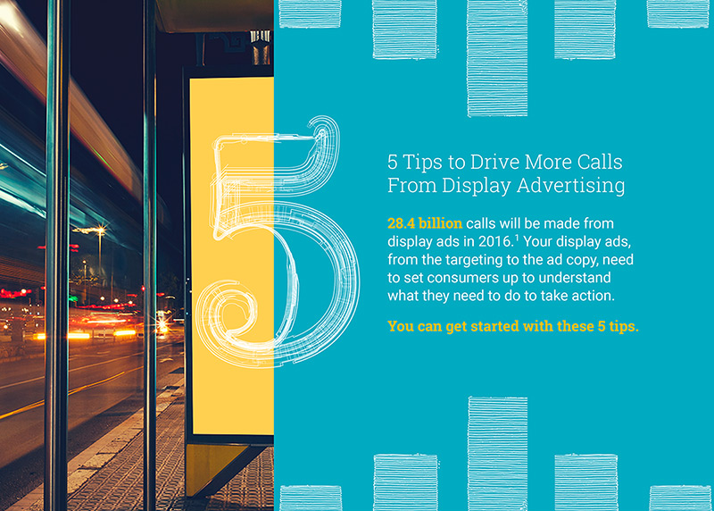
DESIGN EXPLORATION 2 – Object Photography/Iconic Illustration Synthesis
Visual Elements
This design direction focuses primarily on narrative relationships between photography and text. The photos used in this exploration look beyond the boilerplate “lifestyle” stock photography used in other B2B or B2C websites, depicting people engaged in various related activities. The function of photography in this design direction can be sorted into 2 groups: promotional and representational. Images of objects and environments can be used figuratively, as tropes for driving the promotional messaging in service of our value propositions. Representational object and environment photographs, in which a device and its technology are the primary focus, highlight the smartphone as the object around which our products and services orbit. Representational photos can be given iconographic support to push them in the right direction.
Core Concepts
It is important to remember that as a B2B provider, DialogTech is targeting a marketing-savvy audience. Our marketing must up the ante, conceptually, for potential clients who have a more sophisticated understanding of images that sell. Both types of photography are sometimes directly and sometimes tangentially related to master narratives that align with the DialogTech value propositions. Examples of this narrative are:
- X is missing parts that need to be found to make X whole (DT has those parts)
- X is inaccurate/unreal/useless, or has no value unless X is corrected/made real (which DT can do)
- X is not contemporary and needs DT to reform or upgrade it
- X is calling out to be used, but is invisible/unnoticed (DT can make it visible and harness its value)


DESIGN EXPLORATION 3 – Flat Color Narrative Illustration
Visual Elements
This design direction is comprised of stylized illustration with hard, clean lines and flat color. It comes from using stock and original vector imagery. The simple-but-bold shape and color relationships are used to direct the viewer’s eye movement (scan) over the composition in such a way that it functions both as separate discrete elements and a comprehensive whole at the same time. Speed and weight are primary to this aesthetic. Its visual language takes its power from its compact portability: the capacity to pass from decorative, to illustrative, to data visualization roles. Narrative, illustrative Infographics are the best demonstration of this portability, which is furthered by the graphic elements’ ability to work seamlessly with typography and data.
Core Concepts
The flat-color look drives a specific but almost ubiquitous visual identity in the tech startup marketing space. Even tech giants such as Twitter and Google employ the same image and messaging tone that small-fry startups use, and they do so to establish the “humble giant” personality of their brands. Fresh, forward-thinking, unpretentious and human: these sensibilities stem from a philosophy of letting technology be what it is rather than trying to make it look like something else. A two-dimensional, flat button shape on a screen shouldn’t be styled with bevels to imitate the appearance of a physical button. A digital environment is in a different space, a future space, in which data becomes visibly tangible and utilized to best explain and promote the digital products offered by DialogTech, and the problems they solve for other marketers.